Monday, November 28, 2011

The Phone Marriage

Title: The Phone Marriage
Choong Wai Sin
B0902560
Description: People these days are too busy with their cell phones. Things are easily being replaced by cell phones. People even confess to their loved ones by sending a text. Some even ask someone to marry them through the phone. In this drawing, I want to say that marriage is between two humans but not two cell phones. During this important event, we should put away all our cell phones and celebrate the bridegroom and bride’s significant moment. It is also a form of respect to them.
 

Thursday, November 24, 2011

Edited based on lecturer's comment.

After my presentation, my lecturer suggested that i should alter the water in my water dispenser so that it wont look like a patch of blue colour pasted on the water dispenser.

This is my initial artwork.

I altered the texture of the water using TEXTURE. 

This is the final artwork. it looks more natural now.

Monday, November 14, 2011

The Three.

#1 The Phone Marriage

1. The picture of the window is taken from the internet. http://upload.wikimedia.org/wikipedia/commons/1/16/St_Ludmila's_church_-_window.jpg
2. The window was created using LASSO TOOL. Then i used WARP TOOL to make it feel like surrealism.
2. STROKE was added to the outermost of the window to create 3D-effect.
3. The colour blue was chosen to show the sky outside of the church.

1. The iPhone 4 is a picture taken from the internet. 
2. I edited the phone by using LASSO TOOL.
3. I changed the shape of the phone to fulfill the idea of Surrealism, i hold on CTRL + T to transform and right click to open up this window. I used WARP tool.

1. The picture of the wood is taken from the internet.
2. I drag the picture to the canvas and used the CLONE STAMP TOOL to stamp the wall of the church as well as the floor.
3. clone stamp tool was used so that it wont look square by just pasting it all over.

1. The stage carpet is not taken from any website. 
It is created by GRADIENT TOOL with some BEVEL AND EMBOSS to change the texture.
2. The colour red was chosen for the stage to show love and affection in the church.

 1. The cross is taken from the internet.
2. To create the 3D-effect, i have used WARP TOOL and added DROP SHADOW for the cross. 


#FINAL ARTWORK


 #2 The WineBottle Phone

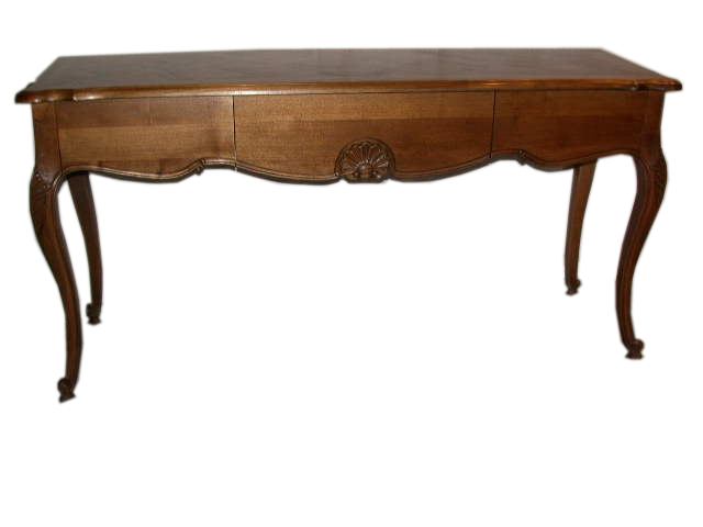
1. The image of the table was taken from the internet. 
2. I hold on CTRL + T to transform, then right click to open up this window.
3. I used tools like SKEW, DISTORT, PERSPECTIVE & WARP to create the angle&size that i want so that it looks like it's leaning on the wall.

1. The vase was taken from the internet.
2. However, i changed the colour of the vase to slightly orange red using COLOR BALANCE to show warmth.
3. i also used WARP TOOL to change the shape of the vase.

 1. The wall, floor and the mat was created using BEVEL AND EMBOSS, TEXTURE.
2. The colour like blue was used as the wall to show cleanliness and the yellowish floor is to show calmness.
3. Texture was added to the wall and the floor to create roughness so that it wont look plain.

1. The leaf was taken from the internet.
2. LASSO TOOL was used to cut the picture out.
3. The layer was duplicated by DUPLICATE LAYER, to show more leaves.
1. The image of the clock was taken from the internet.
2. I used tools like ROTATE,SKEW,DISTORT,PERSPECTIVE&WARP to create the angle that i want.
3. I used COLOR BALANCE to change the colour of the clock as well.

#FINAL ARTWORK


#3 The Phone Dispenser

1. All objects used the LASSO TOOL to cut the picture out and being dragged to the canvas.

1. I go to Image, Adjustment, Colour Balance to choose the colour for the water dispenser.

1. The Phone and the wall was created using the GRADIENT TOOL.
2. Blue was used as the water dispenser to show cleanliness.

1. The tiles of the floor was created by using TEXTURE and was edited using PERSPECTIVE tool.
2. All images are created using WARP TOOL.


#FINAL ARTWORK

Wednesday, October 19, 2011

the sketches.

Surrealism
Reference artist : Salvador Dali
1.
Elements of Design
a) colour > primary colour is blue and red whereas secondary colour is brown.
Principle of Design
a) dominance > the phones are in black to make them stand out in the drawing.

2.
Element of design
a. line > straight lines to illustrate neatness and also symmetry
b. size > the largest phone infront to show depth 
Principle of design 
a. repetition > the shapes ares the same but different in size

3. 
cultural association > cup in blue colour shows cleanliness.
phone and social world should not be combined
                                         
4.
5.
6.
                                              7.
Element of Design
a. direction > the colours are horizontal to show formality
Principle of Design
a. gradation > colour from a light tone to dark tone
b. colour is analogous > colour next to each other.

8.
                                              9.    
10.


11.
12.

14.
                                           15.
16.


17.
18.

Sunday, September 18, 2011

Surrealism.

Artist name : Salvador Dali (May 11, 1904 - Jan 23, 1989)
Art movement : Surrealism

What is surrealism?
  • Surrealism is a movement that expresses the imaginations as revealed in dreams.
  • free of the conscious control of reason.
Aim of Surrealism
  • reveal the unconscious and accommodate it with rational life.
Example of artwork
three sphinxes of bikini

Elements of Design:
a. line - different kind of line were being used, straight, curve, heavy, light, soft or hard.
b. shape - is a well-formed shape, is not confusing.
c. direction - the lines are mostly vertical that gives us the feeling of balance, formality and alertness.
d. size - the size of the object infront is obviously bigger than the ones behind it, this shows that it is closer compared to the other one.
e. texture - the texture of the object is smooth.

Principles of Design:
a. balance - the large light tone object is balanced by the darker smaller object at the side.
b. gradation - it is dynamic, it has a gradation from light tone to dark tone then to light tone again.
c. repetition - the objects look similar but they are not the same. it shows variation.
d. unity - the picture shows that it is in a desert. the objects link to each other and show unity.

sleep

Elements of Design:
a. colour - the colour is very clear and not messy. it consists of primary colour like blue, secondary colour like orange.
b.. value - high value between object and the background. the object is dark in colour and background is light in colour, it shows a great contrast and balance.

Principles of Design:
a. contrast - the object at the center shows more contrast compared to the one behind it.
b. harmony - this picture shows harmony. the colour of the objects are almost the same, giving it a feeling of harmony and not confusing.
c. dominance - dominance of the object gives interest to the artwork. it stands out in the picture. it attracts attention.

Other artwork
melting clocks

Reference
1. Salvador Dali self portrait

2. three sphinxes of bikini

3. sleep

4. melting clocks

Friday, September 16, 2011

Aspiration&Dreams.

My name is Choong Wai Sin and currently studying my psychology degree in HELP University. I have been dreaming of becoming a psychologist since young. Having the curiosity of how human thinks and why do they behave in such a way, leads me into this field.

In my university, I also took up design class as my elective because i think i should learn courses from other fields as well. Design was my first choice as i can learn how to use Adobe Photoshop and edit my own pictures. That is the thing that i always wanted to learn. I actually took up a photoshop class in my high school, however, it did not last long as i do not have the time to stay back every week. Therefore, now i took up this opportunity to take design class as my elective.

My dream is not only to be a successful psychologist but also a creative person. In order to succeed in my field, i have to think out of the box and try very hard to catch up in this design class. As i am not quite a creative person, therefore i must work even harder compared to other people in the class. People say, you must have a vision then only you will become successful. So now i will work towards my vision and dreams, hoping that one day it will come to pass.

Monday, September 12, 2011

How to design the header?

Header is the most important thing in a blog, because it is the first thing that people see when they come to your blog.
Therefore, creating a header is very important.
It should be attractive enough to make sure the reader continues reading your blog.
For my header, i used Photoshop CS3.

Here are the steps:

First of all, i chose a picture that i want to use.

Then i used magnetic lasso tool to crop out my head and my body separately.

Then hold Ctrl + T to adjust the size. My head is enlarged whereas my body has become smaller. Then i combine both together and merge both layers.

Next, choose a background that you want, and drag it into the merged layer. To make sure the picture blends well with the background, select the merged layer and click on Filter (on the menu bar) -- blur -- Gaussian blur -- change the radius accordingly.

Finally, add in your blog title and merge all layers into one.

TADAA! now you're done! (: